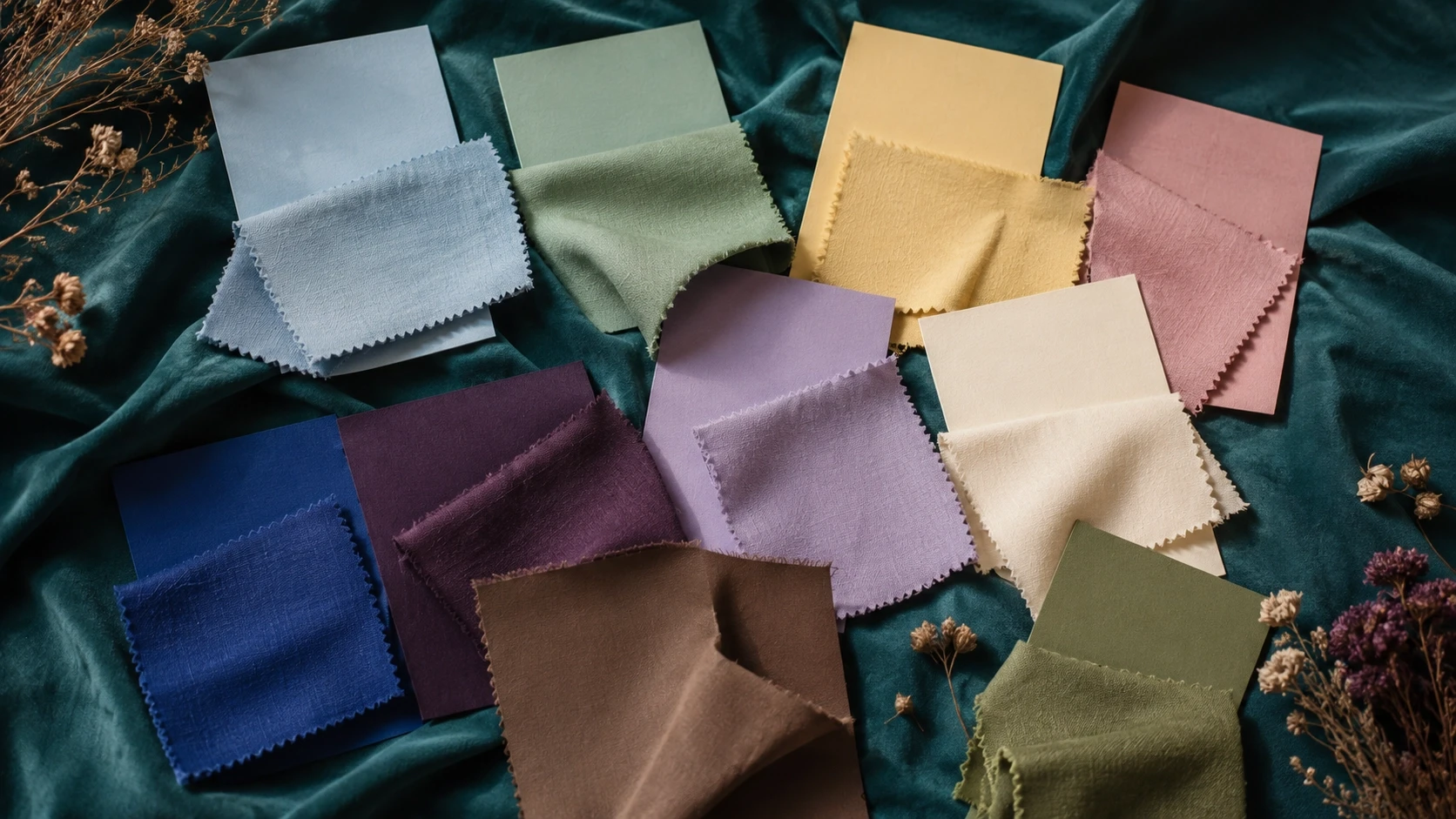
Every lawn season introduces a new colour conversation, but 2026 marks a more deliberate shift than the subtle refinements seen in recent years. Rather than chasing visual intensity through stark contrasts or high-saturation hues, leading brands are embracing palettes that feel calmer, richer, and more considered. The move away from bright whites, electric tones, and cool neons reflects a broader change in how summer collections are being curated.
For brands, manufacturers, and print studios, this is more than a styling preference. Colour sits at the foundation of textile print design, influencing everything from motif selection to the final commercial appeal of a collection. As the market gravitates towards warmer, more nuanced palettes, successful print development begins with understanding how these colours reshape the design process.
The Pastels Taking Over
Soft tones continue to dominate the lawn landscape, but the character of these colours has evolved. Powder blue, mint green, butter yellow, tea pink, and ivory are appearing across major summer collections, offering a palette that feels fresh without relying on stark brightness. These shades bring a sense of ease to warm-weather dressing while maintaining the refined aesthetic that increasingly defines premium lawn.
Unlike the cooler, almost washed-out pastels that characterised previous seasons, the latest interpretations carry greater warmth and depth. They feel more substantial on fabric, allowing prints to retain clarity without overwhelming the eye. The result is a softer visual experience that remains sophisticated rather than understated.
Among these shades, lilac has emerged as one of the defining colours of the 2026 season. Its versatility allows it to move comfortably between delicate floral compositions, contemporary abstract layouts, and more traditional ethnic arrangements. Used as either a primary ground or an accent, it introduces elegance without demanding attention, making it one of the most commercially flexible colours in current lawn collections.
The Rise of Warm Depth
While softened pastels are setting the tone for daytime dressing, a parallel movement towards richer grounds is adding greater variety to seasonal collections. Deep purple, mocha mousse, cobalt blue, and black are increasingly appearing across premium lawn ranges, offering a stronger visual foundation for more expressive print work.
At the same time, heritage-inspired colour stories continue to gain momentum. Rust reds, indigo blues, ochre, and moss greens reference traditional craft while feeling entirely contemporary when paired with modern layouts and refined detailing. These colours bring depth to collections without sacrificing wearability, making them particularly effective for brands seeking longevity beyond a single trend cycle.
For print designers, darker grounds fundamentally change the relationship between colour and motif. Florals gain greater visual drama against deep backgrounds, while ethnic patterns acquire a stronger sense of dimension and richness. Contrast becomes more controlled, secondary colours behave differently, and highlights must be introduced with greater precision. Rather than simply placing an existing design onto a darker base, the entire composition often requires reconsideration to achieve the intended balance.
What's Fading Out
Just as important as the colours gaining momentum are those quietly disappearing from seasonal launches. Stark white grounds, once a defining feature of summer lawn collections, are becoming less dominant. While white continues to have a place within the market, it no longer serves as the default canvas for premium print design.
Equally noticeable is the absence of neon and electric tones that previously appeared as seasonal accents. Across recent launches, brands are favouring restrained sophistication over immediate visual impact. The emphasis has shifted towards colour stories that feel enduring rather than attention-seeking, creating collections with greater coherence and maturity.
Compared with seasons that leaned heavily on bright pastel combinations, the 2026 landscape demonstrates a stronger commitment to layered palettes and deeper tonal relationships. This evolution reflects changing consumer preferences as well as a broader movement towards collections that communicate refinement through colour rather than intensity.
What This Means for Print Design
For print studios, a change in colour direction is never simply about selecting different shades. Ground colour influences every stage of design development, from motif scale and line weight to border construction and colour separation.
Warm, deep backgrounds require florals with different visual density than those designed for crisp white grounds. Fine detailing that performs beautifully on ivory may disappear against mocha or deep purple, while borders often need stronger tonal transitions to frame a composition effectively. Even abstract textures and geometric layouts respond differently depending on the warmth and depth of the base colour beneath them.
These considerations cannot be addressed as final production adjustments. They must be integrated into the creative brief from the outset, allowing colour, composition, and print technique to evolve together. Whether a design is intended for digital, rotary, flat, screen, or block printing, successful colourways begin with an understanding of how the chosen palette shapes the entire visual structure of the print.
The strongest lawn collections are rarely defined by individual colours alone. They succeed because every design decision supports a coherent seasonal narrative, with palette acting as the framework that brings the collection together.
As colour preferences continue to evolve, print development must evolve alongside them. At Korra Designs, tracking these shifts is an essential part of the design process. Every collection is developed with an understanding of where the market is moving, ensuring that original print designs are not only visually compelling but also commercially grounded for the brands and manufacturers who bring them to market.